
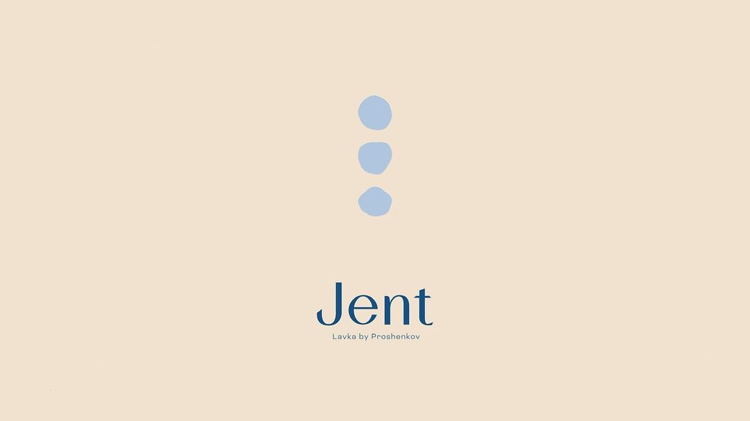
Jent Lavka by Proshenkov
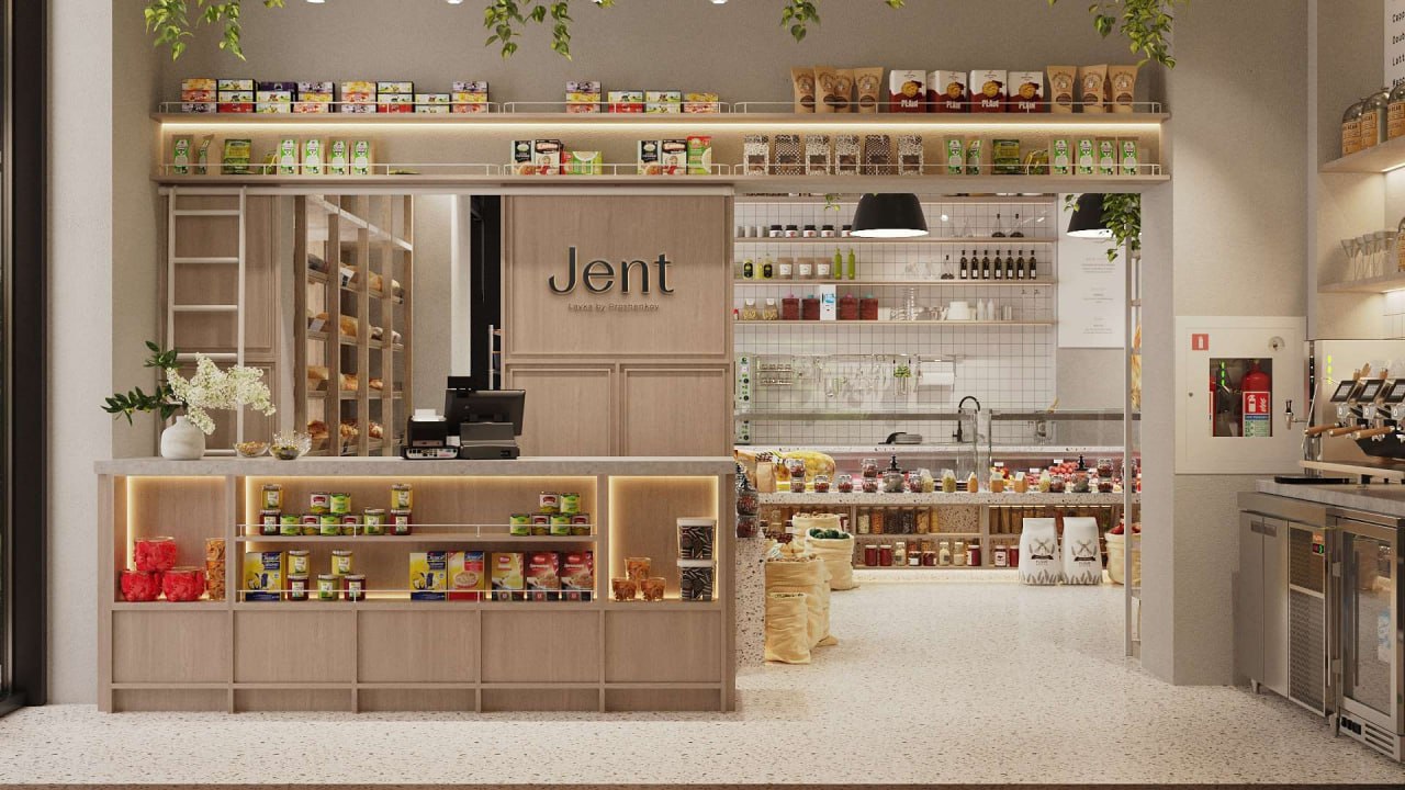
GLYPH presents the culinary shop Jent Lavka by Proshenkov. A brand based on a simple and clear idea – high-quality comfort food.

10
GLYPH presents the culinary shop Jent Lavka by Proshenkov. A brand based on a simple and clear idea – high-quality comfort food.
20
When creating the branding, we were inspired by the philosophy of the chef and founder of the shop, Alexander Proshenkov. The passion for comfortable and high-quality food, as well as the love for seasonal products from local farmers, are reflected in the idea of the Jent project.


30
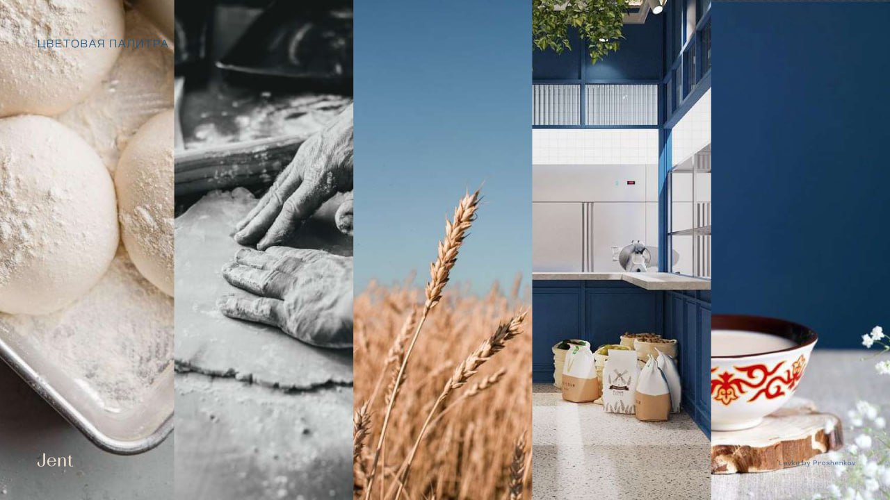
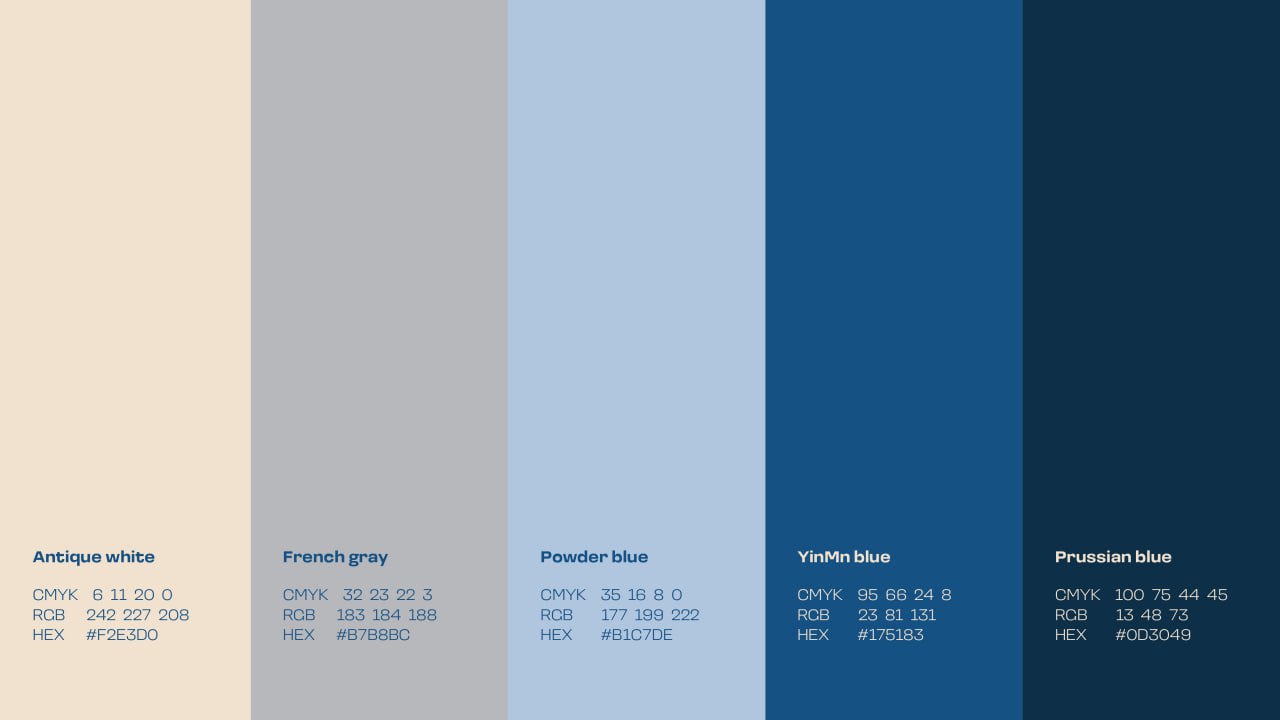
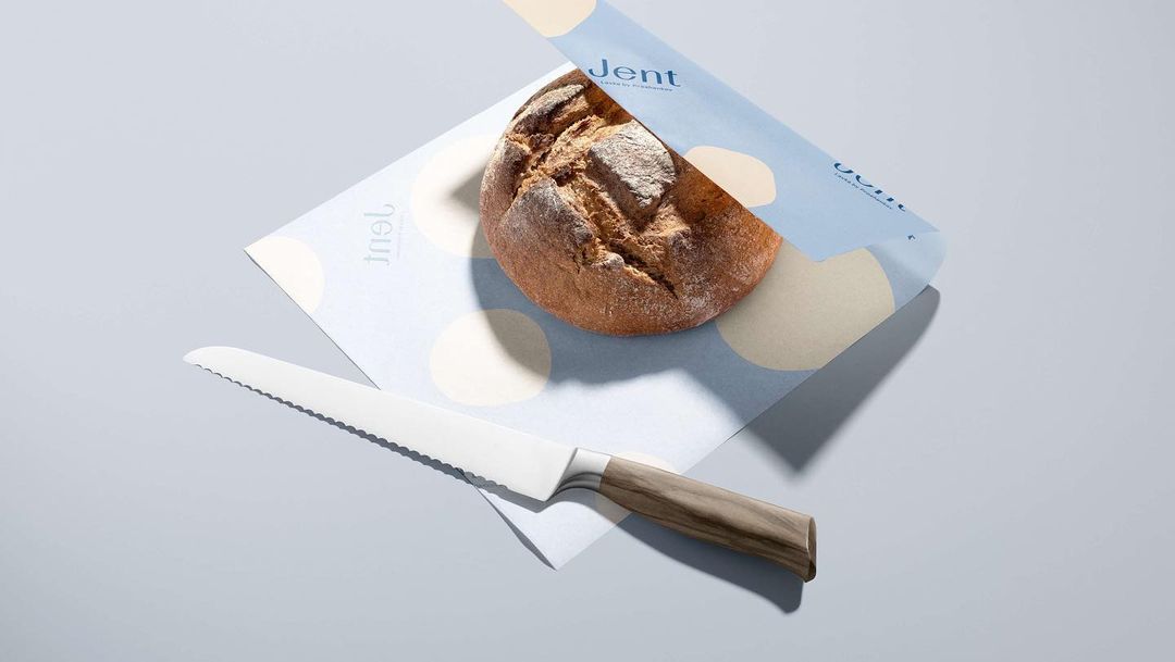
"Every shade tells a story of taste" The color palette in Jent's branding emphasizes a quality approach to product selection and creates a visual representation of the flavors and aromas found in the shop itself. It is a harmonious combination of natural and calm shades that not only decorates the space and packaging of Jent products but also tells the story of each dish and its origin. Antique white reflects the purity and simplicity of the ingredients, as well as the delicacy and richness of textures. French grey symbolizes durability and tradition. Powder blue conveys lightness and freshness. YInMn blue represents the boldness in creating new flavor combinations. Prussian blue reminds us of the richness of nature.
40
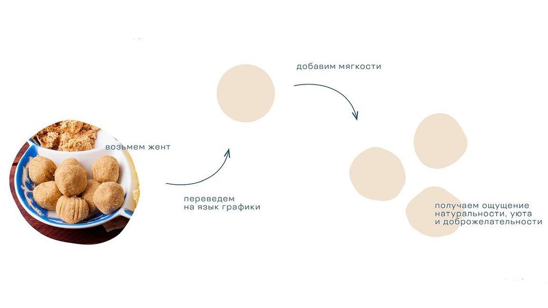
A place where culture and culinary arts meet to offer a new and interesting experience to its guests. The naming concept of the culinary shop Jent is about love and attention to detail in creating dishes. "Zhent" is a traditional Kazakh sweet, the preparation of which requires patience and focus.
Thanks for watching!
Show some love.