
ALIA
10ALIA
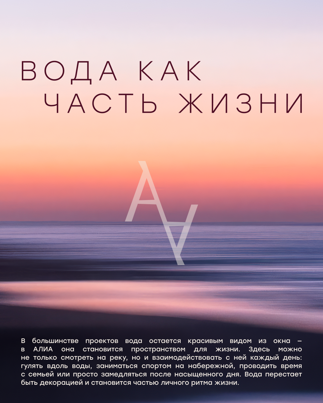
We started working on the ALIA project with a strategy. We researched the market, the audience, and the context to find an idea that could become the foundation for all subsequent communication. It was important for us to formulate not just a beautiful message, but a meaning that naturally grows out of the project itself. Previously, in the ALIA communication, it was important to show that this was already a living district with its own environment, residents, and its own rhythm. As the project developed, this fact became a natural part of its perception, and the main focus shifted to one of the key features of the location — its proximity to the Moskva River. This is how the concept of “First Line of Life” emerged, becoming the starting point for further work on the brand.
20Identity
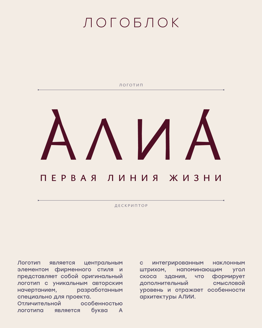
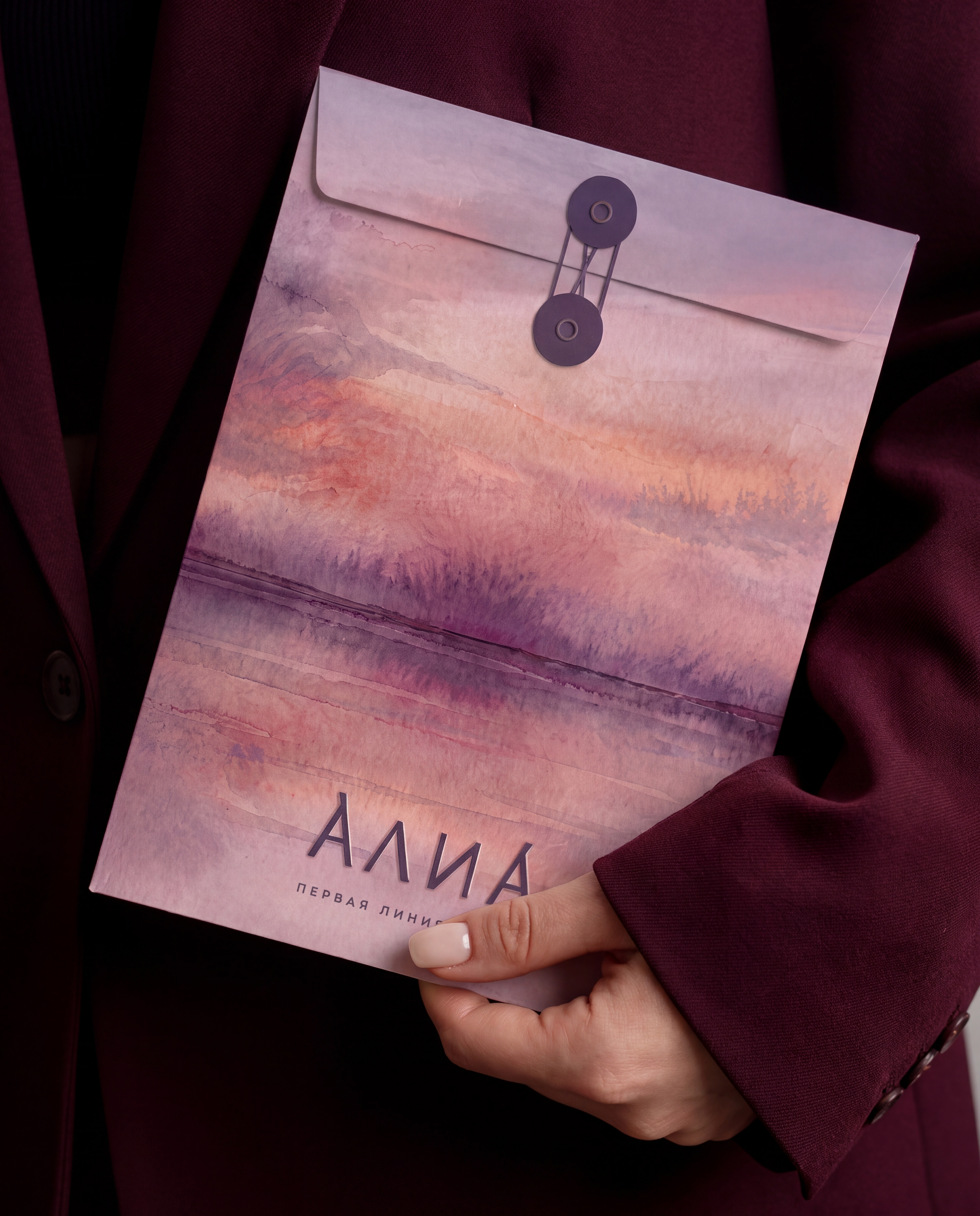
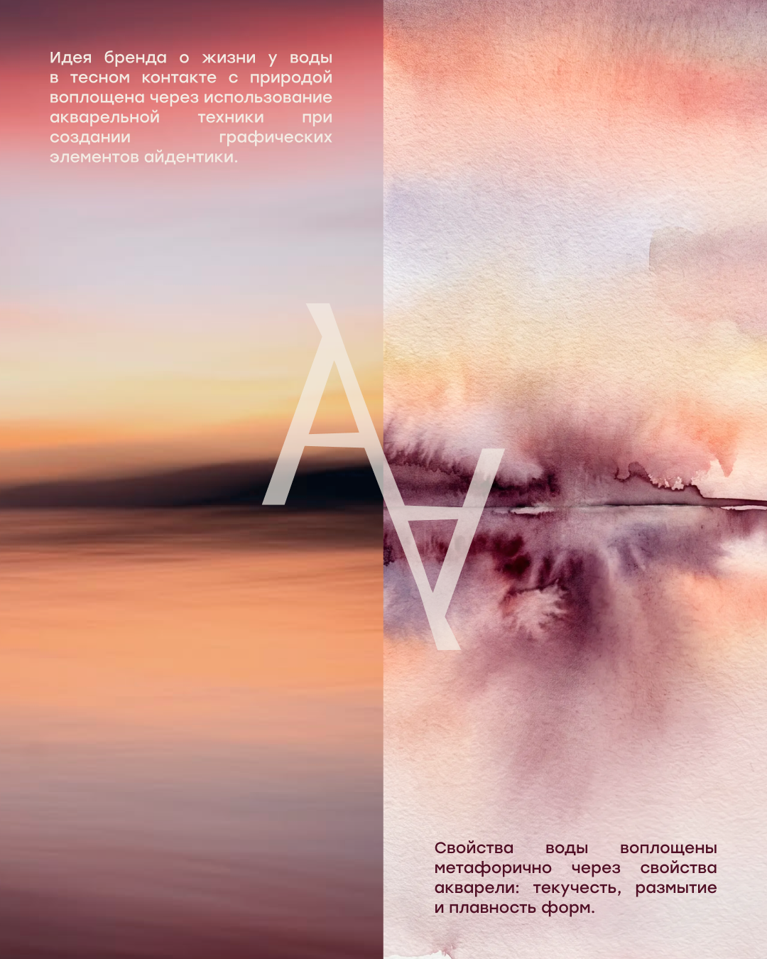
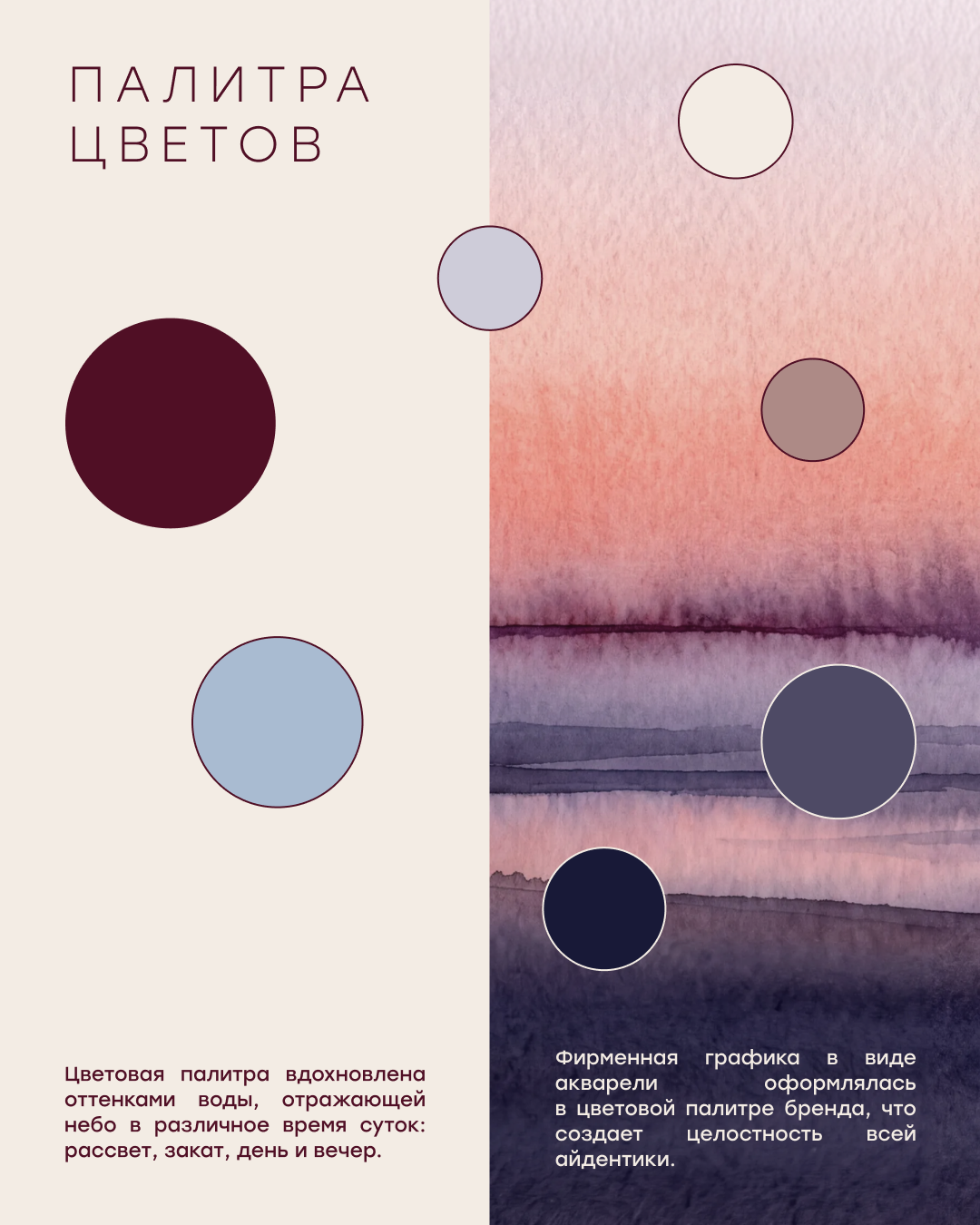
It was important for us to convey the presence of water without its direct image. Therefore, the identity is based on its properties — movement, transparency, depth and reflection. Watercolor became one of the key elements — lively, plastic and a little unpredictable. The horizon line formed another recognizable motif of the system, and the updated monogram continued the theme of reflection and the connection of architecture with water. Thus, the visual image of ALIA began to take shape into a single system capable of working in different formats and preserving the nature of the project.

30Brandbook
The next step was the brandbook. In it, we documented the main principles of ALIA’s visual communication: how to work with graphics, color, typography, composition, and various media. The goal was not just to compile a set of visual rules, but to create a system that could evolve alongside the project and remain cohesive and recognizable at every point of contact with the audience.
40Advertising campaign
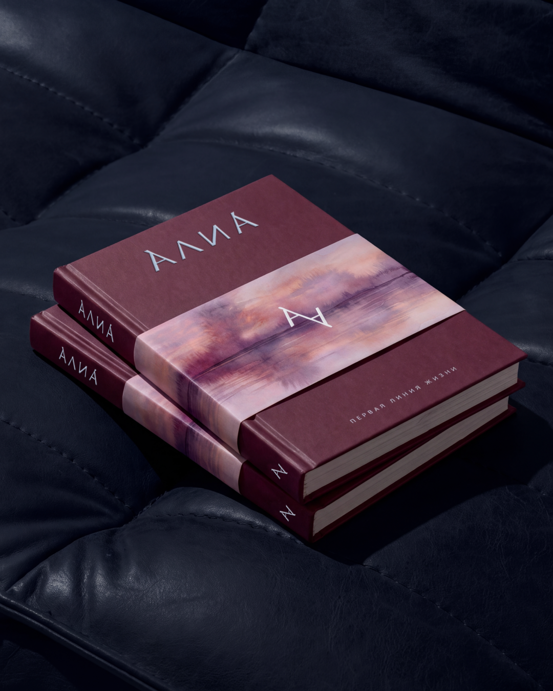
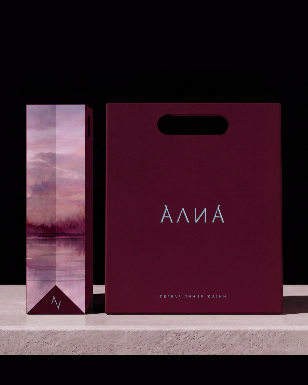
After that, the project’s visual language went beyond the brand book and started working in the urban environment. We developed a full‑fledged advertising campaign, preserving the main elements of the identity — watercolor graphics, the horizon line, reflections, and the interaction of architecture with water.
50
In some visuals, the towers continue in the reflection of the Moskva River, while in others the real urban landscape gradually transitions into a watercolor style. Thus, the visual system received a new, more extensive continuation, now in communication with the city. It was important for us that at every stage — from strategy to advertising media — the project remained cohesive. That the idea, visual language, and communication did not exist separately from each other, but formed a single system.
60
GLYPH × ASTERUS × ALIA
Thanks for watching!
Show some love.